Responsive Web Design
CCDMD (The Collegial Centre for Educational Materials Development) has just put a new version of its website online. The April 2012 edition of Clic gives an overview of the process (in French).
Usability and accessibility were the guiding principles for the site’s designers. Although the old version was already available on mobile phones (smart phones and tablets), the new design had to be clear, clean and attractive in all environments.
Defining Responsive Web Design
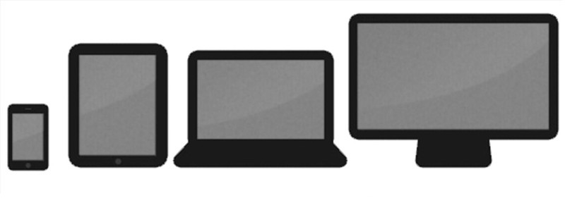
Responsive web design was the answer for this and other online projects. The concept is simple – just build a site that adapts to the dimensions of different equipment. Thus, websites showing videos, such as the CCDMD’s upcoming product l’Activité-projet, will adapt to various formats of computer monitors, tablets like the iPad and smart phones like the iPhone.

Responsive Web Design for Variable Screen Formats
One might think that this requires complex programming, but this is definitely not the case. Designing the visual interface so that the site can adapt remains the challenge. In order to make this concept more concrete, here are some screen captures of l’Activité-projet which is due to be released in Fall 2012.

4 pixel formats for the site Activité-projet (iPhone-320, iPad-420, Laptop-1024, Full Screen-2200)
The concept of responsive web design must allow each unit to display the design that suits it best. To achieve this, programmers use media queries which, incidentally, are nothing new on the web since they were used to create style sheets for printing a web page. For fans of web programming, there is an excellent description of this very simple-to-apply process at the following address: http://designmodo.com/responsive-templates-frameworks/
Responsive Web Design Principles
Visual design principles to take into account include the following:
- Rethink the informational density of a site allowing more space and prioritizing content. In l’Activité projet, the videos are the essence of the site.
- Simplify interactions (reduce the number of menus).
- Provide better visibility for research tools (make them always available).
- Make clickable items responsive (adjust buttons and spaces to screen size).
- Finally, use footers more effectively.
Concretely, this involves careful consideration during the design process. For example, the number of menus is reduced to 3 or 4 items whose locations vary depending on the size of the screen. The spaces between the buttons and menus as well as their sizes may also vary to allow for better use of touch screens which do not use a mouse. Although this seems simple, these features need to be seamlessly integrated into a coherent design.
Using responsive web design, one can arrive at a site that perfectly adapts to any size of screen. You will notice more and more responsive design online including the new CCDMD website. For those who want to get a peek at how this concept works and a glimpse into the design process behind the new CCDMD site, link to the following:http://mediaqueri.es/ which provides some excellent examples of responsive web design. Resize the browser window when you visit to see responsive design in action.
Do you know any sites using responsive web design that would be of interest to our readers?

