Why We Really Should Care About Infographics
Your message is only as good as your ability to share it. I teach a class in Advertising, and theory is a very hard sell for Millennials. So, after hitting a brick wall, I decided to assign a part of the theory to each student, making them responsible for teaching it. And, I make them do it by creating an infographic of their topic.
The Vanishing Line between Excel and Fine Arts
As another tool in our repertoire and a different viewpoint on the same old information, infographics are a fun way to learn and present data without a lot of reading. It may sound harsh, but my students are unquestionably NOT fond of reading.
The Value of Visualization
Infographics have their origins in Excel data presentation. Infographics transform those unappealing, austere-looking Excel charts into something that Millennial students — who are highly visual in orientation and who have grown up in a world where everything is “designed” — can easily process.
Teachers always want to know the history behind things: Richard Saul Warren, the originator of the Ted talks, coined the term infographics. Warren was influenced by Edward Tuft, known as “the da Vinci of data”, who developed “chart junk: the use of charts in fine art”. Yes, when you go to the art gallery, infographics are being incorporated into art work. The firm line that used to exist between Excel-type charts and fine arts has started to erode.
Data Visualization
At my age, I’m skeptical about numbers, and how numbers are presented to the public. We had to read a book in university called ‘How to Lie with Statistics.’ Well, in an infographic, the hard data is present, but the design elements can add another level of deception or seduction – people tend to impute more authority and credibility to well-designed graphics than to something cranked out on the spirit master down in the basement.
In infographics, the raw data are there, the statistics, the correlations and so on, but they’ve developed into what’s called “data vis” (data visualization). The press coined 2013 “the year of the infographic”. The presentation of data in newspapers and magazines has changed considerably: If it doesn’t look good, people don’t read it. Infographics are 30 times more likely to be read than simple Excel-type charts and graphs, and we see them almost daily in The National Post and Maclean’s magazine.
Here is an example of an infographic. The amount of money each country gives to charity is illustrated by the size of each circle. Contrast this infographic with an Excel-type chart of the same information. The same information is present in both formats, but the infographic is art as well as information, and comparisons are easier to make in the infographic – particularly for those of our students’ age.
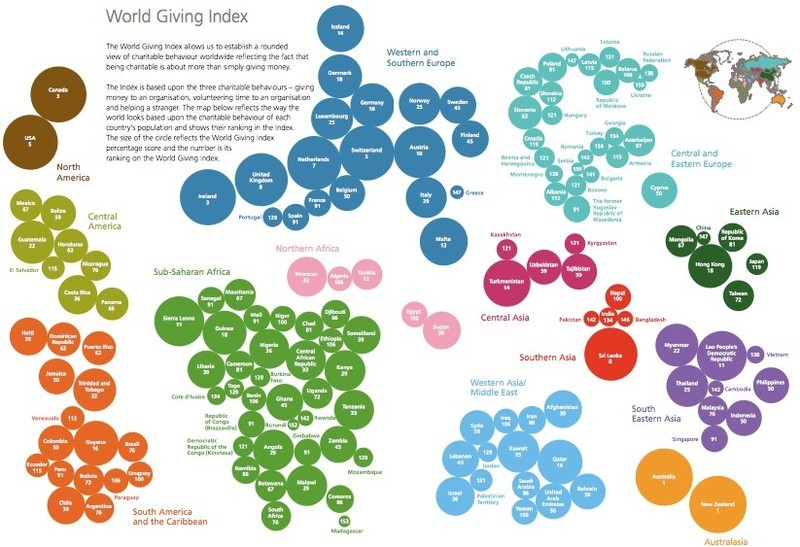
Infographic of World Giving Index
Data Vis Examples and Tips
Pinterest is a good tool for anything Design. You can get great examples by searching “infographics” on Pinterest.
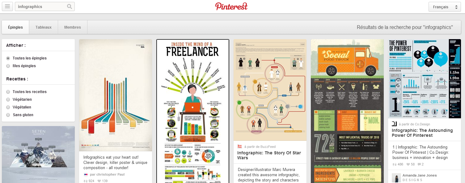
A search for Infographics in Pinterest will provide a wealth of inspiration
If you assign an infographic project to your students, here are some ground rules.
First, students need to decide on a focal point for their infographic because the information will be presented in a non-linear way: No one’s going to start reading at the top (like Chapter One in a textbook) and work all the way to the bottom. As in the example above, focal points are based around a big graphic or a large heading.
Infographics must also contain FACTS. Young people can get carried away with the design and the decorative elements. The hard core facts still have to be there, to maintain academic integrity. I’ve “forced” my students to put in footnotes. They need to attribute their source. Students like to wriggle out of this requirement, but without facts, an infographic is just wallpaper. It’s useless.
Then you need symbols. PowerPoint makes these symbols and icons for the students, and almost all of our students arrive knowing PowerPoint well because they’ve covered it extensively in high school. PowerPoint can insert little icons into the students’ graphs. Demographic categories can be illustrated with icons rather than words, for example an icon of a baby or one of an old person. Remember, students do not have to be designers to come up with these; they’re in PowerPoint’s design library.
Color is obviously a requirement. Black and white don’t attract attention, so limit students’ colour combinations. Suggest the use of complementary and contrasting colours. Why I wanted to show you that video at the beginning of this article was the 7s. The 7s are immersed in a field of numbers, and as soon as they changed the colour, you zoomed right in!
Ribbons and Badges
Text considerations are also important. Your students will be tempted to go on Wikipedia and copy long incomprehensible screeds and paste them into their infographic. They need to minimize their text and make what’s left punchy. For example, put it into bullet form. (Some people only accept bullet form, and they consider paragraphing to be so last century.) Academically, this is a good way to “force” the students to read carefully and extract essentials from those long screeds.
If paragraphs are included, make them stand out in bold and use “dividers”. Some of my design students use blocks of colour behind the text that function as dividers. You can also make your dividers in shapes, thought bubbles for example. Then there are the “ribbons and badges” that characterize the way we present information these days.
Conclusion
Infographics are not “time wasted” – even if you’re teaching geography or nursing. I’m surprised and shocked at how few students understand how a pie chart (or any other type of chart) works, so here’s a good opportunity for them to explore some numeric data carefully and present it in a visually attractive way. Please remember that you do not have to be good at Illustrator, Photoshop, or other design programs to do infographics, nor do your students. You can just use copyright-free images off Google, add graphs from PowerPoint, cut them out and stick them on. As academics and teachers, in addition to our goal of visually communicating information, we are sharpening our students’ visual literacy.
